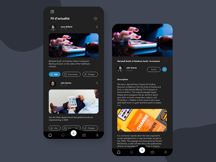
Redesign Linkedin Mobile App | Dark mode
Sometimes it happens when one uses the application and wants it to look different, to be more convenient.
Here is our redesign for the Linkedin Mobile app in dark mode. I tried to give a fresher look and feel and to reorganize the information architecture
Share some love and drop a comment below if you like it. 😊
_______
Let's connect:
More by Sourya Siva View profile
Like
