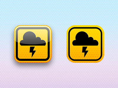
When in Rome
Working on updating Weather Alert USA's icon for iOS 7's new icon sizes, since the corner radius has changed everywhere and it looks terrible with the new radius.
As for the design overhaul, Apple's video was a hell of a way to introduce it. But like many others on Dribbble, I'm not a fan of the icon styles (not just the home screen icons; the toolbar icons are a little too consistent). And as one of my former colleagues at Yahoo! tweeted, the interface has a lot of legibility problems as well.
But I'm willing to give Apple the benefit of the doubt here.
Jony Ive assumed the lead role of all design at Apple about 7½ months ago. Coincidentally, the team under him who redesigned the entire operating system looks like they took about... 7½ months. Anyone who works in software understands that is a ridiculous timeline for such an endeavor.
I feel as though a lot of these wrinkles will get ironed flat over time.
EDIT: Attached an adjustment. Fixed the roundrects based on the template I made. The difference is subtle, but it's enough to be worth considering.

