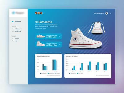
Product Comparison Dashboard
Brief:
You have received a data-set from a researcher. They ask you to visualise the data in an engaging and interactive way. The researcher wants to showcase the data to a client.
The client is based in South Africa and sells sneakers in their store. The client also has branches in the USA, in the UK and in Australia. They are interested in stocking the Converse Chuck Taylor shoes and want to see some market research to make sure they sell it at a good and fair price.
Design a data visualisation that communicates the research in a user-friendly manner. Please use charts (bar graph or line chart or whatever chart you feel is best) somewhere in the design. Also make use of the Brand Guide for colour and UI.
Solution:
My focus was to create a highly visual way of showcasing the data, instead of just using a traditional dashboard layout.
I've split out the data into three sections. Dashboard, All Star High, All Star Low.
Dashboard - shows data for both shoe types as an overview.
Each shoe has its own screen where the user can view Shoe-specific data, like eg. Current average price, Price forecast, and a breakdown of store value percentages etc.
By dividing the data across three screens it lends itself for a bit more freedom in creativity to make the data more digestible and engaging instead of just showing a myriad of data widgets.
