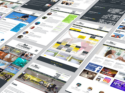
PerForma fitness web design
Four sites for PerForma fitness. Dark template for main intro and blog site, then each color for each subsite which represents specific location and services.
Client wanted clean design, simple, white, uniformed, black and white site. My suggestion was that we add different color for every subbsite.
More by Vladimir Pavlovic View profile
Like
