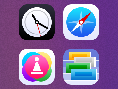
iOS 7 app icons
Looking at the iOS 7 screenshots from yesterday's keynote made my pixel finger itchy. Here's my take on the new iOS app icon style. My goal was to try to unify the look with a little more consistency in style and level of detail, and refinements to the compositions and individual elements in the icons.
I think Apple's taking an interesting direction with iOS, and -- as others have mentioned -- I have no doubt they'll continue to change and improve the look of the icons and the UI.
More by Anthony Piraino View profile
Like
