I didn't ask for this…
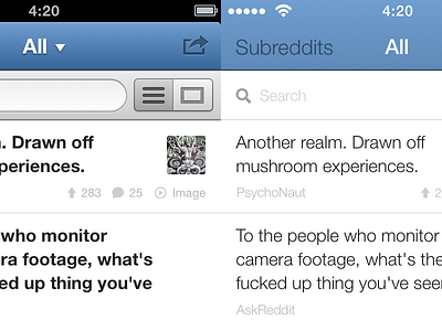
So I'm trying to port this design to iOS7… I think it's horrible. I'll have to find something in between with some smooth gradients and dropshadows for contrast.
But I'm wondering, what do people think of this design now? I'm really confused with the new direction and I'm not sure how to design apps now.
Check out the bigger screenshot to compare.
More by Jonno Riekwel View profile
Like

