Fabrik Architects Logo
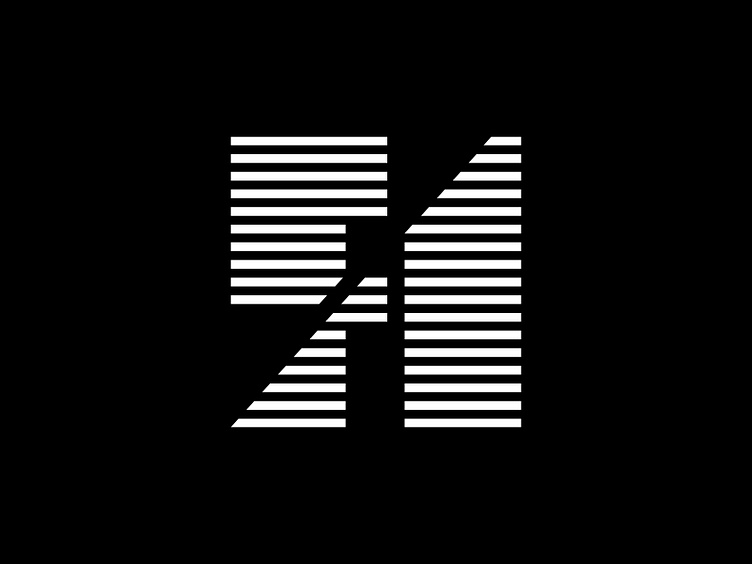
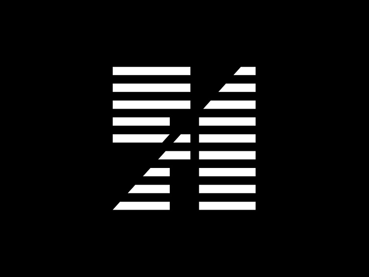
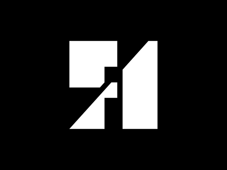
As the client said themselves, architects love lines. This one plays with positive and negative space and a natural synergy between the two letters. We created a gird-based system from this across their title blocks and other communications. There are three versions of this that, just like architecture, has a contextual sensitivity. This also extends to the logotype, which shortens depending on the space it needs to occupy,