Johnson & Krol Part 2
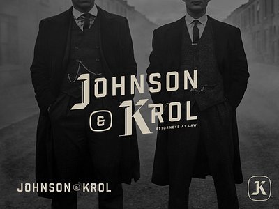
Another approach to the Johnson and Krol brand. I wanted this one to feel industrial and classic at the same time. Utilizing black letter for the monogram and then using a typeface that feels but strong sits nicely next to the drop caps in the logo type.
