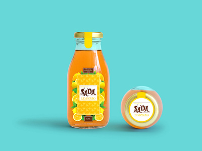
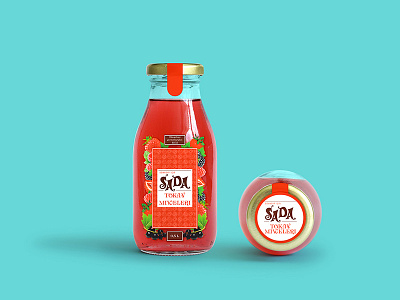
Sada Label design 2015
Sada is a multi-profile non-alcoholic beverage factory, and together we created six lines of beverage drinks. In the following pages, I will introduce two of my favourite projects.
Sada Lemonade is a project of ten labels. The idea was to have a unique and colourful concept for a summer beverage. For this purpose, I built a colour palette relevant to selected flavours. And for the background, I broke down the ingredients into geometric shapes. That allows me to create a unique space for text components. Meanwhile, the fruits and berries are arranged in the label’s frame, which helps it look complete and vivid.
Illustration — Adobe Illustrator
Photo editing — Adobe Photoshop
Check out for more on Behance & Instagram
------------------
Don't forget to ❤️ Press “L” to support the shot and Follow me for more!
------------------
💌 I am open to new projects! design@katerinabot.com


