Logo for a hunting agency
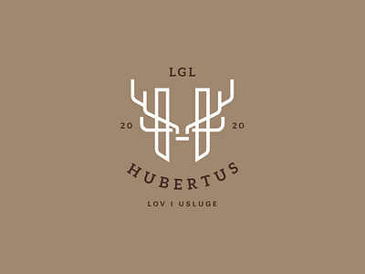
Logo for the LGL Hubertus Agency. It is an agency that organizes hunting in Croatia mostly for foreign clients. The logo was made in the way that the letter H taken from the name Hubertus was presented symbolically as a base for a trophy, in this case horns of a deer that represent hunting. We chose the first letter because it gives a personal note to the agency. The colors we picked, the beige and dark brown are colors we can see in the nature and that is why they go great with the whole logo. The design is simple, clean and modern, therefore easy noticeable and memorable.