Sho Chiku Bai – Brand Refresh
Responding to the modernity that surrounds us, faster and faster, the rebranding project was developed, with the premise of renewing its appearance, to a more modern and minimalist one, without losing its oriental identity.
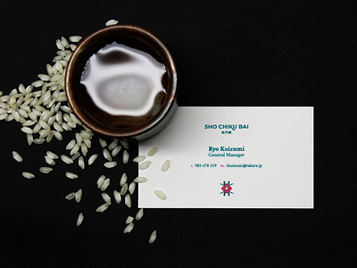
Thus, under the concepts of union and ceremony, it was possible to give it a new visual breath, where we unify its existing symbols, in the midst of what represents the luxury of being a ceremonial product. Finally, it was bet on a package that synthesizes the shape of the grain of rice and that also departs from the conventional and squared.
Throughout this process, we were able to learn more about what Japan means to share, unite and celebrate.
