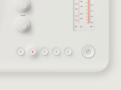
Neumorphism UI Trend 2020 Product Interface
I have seen this UI trend frequently coming by on my timeline. My first reaction every time was: "Wow, that looks nice!' but in reality it will never pass the contrast ratio were you also aim for in a clean crisp design that is accessible for everybody. So I always left it on the side.
Till now, I have decided to give it my first try and play around with it. I thought the product design of Dieter Rams would be a great source of inspiration when using this neumorphism design trend. Basically I started with setting up all the proportions in a wireframe. From here on out I started to play around and have fun with it!
What are your thoughts on this Neumorphism design trend. Will it hold value or is it just a hype thing at the moment? Let me know in the comments below!


