Heavy or light icons?
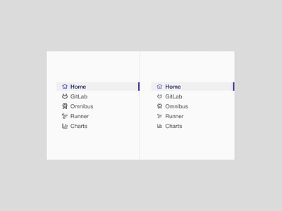

What's your preference and why?
• Left icons created on a 16px grid with 2px stroke.
• Right icons created on a 24px grid with a 2px stroke and scaled down to 16px (effectively a 1.333…px stroke)
Considerations…
• Left stays crisp on any screen
• Right is crisp on HiDPI screens, but will have blurry areas on “standard” definition