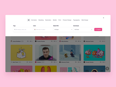
Redesign of Dribbble Filter Selection
Hi dribbblers! ✌️
I have created a little design concept for the filter selection on the Explore page to improve the userflow a little bit. First I would make the menu bar sticky so that you can change categories and filters at any time and don't have to scroll all the way to the top.
When pressing the filter button, this overlay would move in, where you can select multiple filters at once, without having to scroll to the top and without letting the site refresh over and over again.
If you like it, press "L" to show some ❤️!
More by Mathias Dachs-Wiesinger View profile
Like
