Personal Logo: Re-design
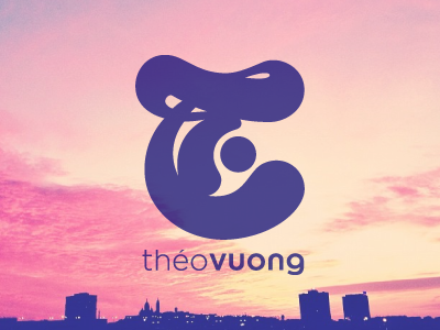
I recently started working on an upgraded version of my personal logo.
The initial design was hand-drawn and presented a few imperfections so I tried re-designing it by cleaning up the edges and evening out the shapes to get a neater and more circular motion.
You can view the OLD VERSION here.
***Any advice or suggestions are more than welcome!***
You can also check out my Instagram for the original shot!
More by Théo Vuong View profile
Like
