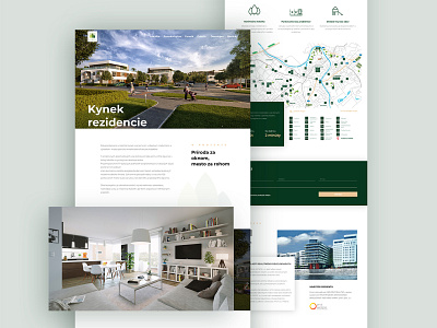
Housing landing page
Hello fellow Dribblers.
Here's a website I did for a housing development.
The visuality respects the overall communication style of the development company. I tried to keep everything fresh and modern, since the development itself is focused on a more high-profile target group.
The colors reflect the development's visual identity.
More by Touch4IT View profile
Like

