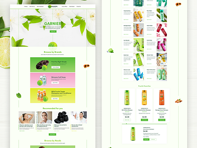
Garnier Website Redesign
The main objective of this project is to modernize the UI and UX design of the existing Garnier website. To achieve an excellent result, the banners were updated and high-quality graphics were selected, the color palette was updated and new changes in the site interface were proposed to improve the user experience of interacting with the brand.
See more:
Behance
More by Tetiana Kramarska View profile
Like
