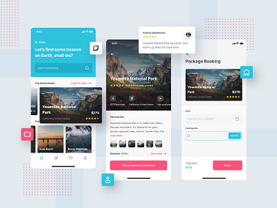
Intravel, Traveling App UI ✈
Hello! This is the UI concept of a travel application that I call Intravel. ✈
In this design, I participated in an event organized by the local Dribbble Community in Indonesia, Designathon #4. In this event, I had the opportunity to study with 23 other participants and some great mentors in one cloud file (thanks to Figma, what a great tool).
Participants are given 1.5 hours to design 2 or 3 pages, themes and briefs are given a few minutes before the event starts. Sssst, to be honest, there is no time for research, maybe there is, but only a little research, and most of it is my own assumption (lol, I beg you not to do this). The next hour was followed by a design review by mentors, an hour full of new knowledge.
"How can you design in only 1.5 hours?" Well, I have lots of time after the event is finished to polish this design again. 😋
In my assumption, when people use this application, the most important and most needed is a search engine that can search for various kinds of heaven on earth, with some recommendations and the best places to visit underneath.
Of course we have pages containing details, descriptions, and reviews of people who have come to the place before. As well as the booking system.
There isn't much I can explain in this short time design. Thank you for the cool event by the Dribbble Community, and thank you for my mentor at this event @panggihsamudra, he was great. 🤟🙌
