Star Shine A Cure Poster
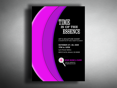
Here is my first poster and logo I ever did in my first fundamentals of graphic design. The nonprofit I created is called Star Shine A Cure. my made up organization raises funding for the SF Public Health Foundation.
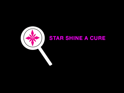
The concept I used was a letter counterforms, by showing part of the C (Cure) to make it look like a ribbon symbol. Colors I used are soothing to the eye and represent healing. I paired to typeface Clarendon for the headline and Helvetica for the body text. The logo is a elegant star shape cross in a magnify glass.
I do have a softspot for this poster and logo since these were the firsts I ever made. Even though it may not be the best design and not typographic pleasing. I appreciated all the knowledge I had to learn about the principles of design.
To work with letterforms, basic typography, grid structures, visual hierarchy, branding and concept development. In the end I think it came out well for being my first cohesive design.