Metropolis Moving - Illustration 1
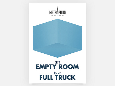
This is the first poster from a series of six to illustrate various moving-tips from the experts. Together with Jesse Rosenfield I'm going overboard to create awesome branding for Metropolis Moving.
With clear typography and simple illustrations, the goal is to give the company a face and playfully help customers. The illustrations will be used throughout the website and printed on different marketing-materials.
Check the large version with awesome gradient-banding from the jpeg-compression!
More by Michiel Andrea View profile
Like

