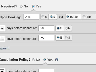
Radio-button-ageddon
Re-architecting our billing system for maximum flexibility and customization. The abundance of radio buttons was making the interface look chaotic -- this is one potential solution.
More by Justin Delabar View profile
Like
