Queued item
Back to this project.
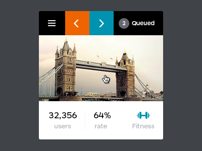
This thing was quite fun to work on. Going one step backward on this one - this is the item added to the queue waiting for user to track it. The info displayed is different b/c you don't work on is yet.
However on this view you can:
✔ go to your habits
✔ move left in the queue
✔ move right in the queue
✔ see where it's in the queue right now
✔ remove from queue
✔ see the info
I know you're probably thinking why why isn't remove is red? Well I didn't want a lot of colors there and Remove is actually replacing the "Queued". Curious on the flow? See here:
*Step 1* - menu with all queue stuff on hover
*Step 2* - remove the item by hovering the queue
*Disabled* state for the arrow(s) when the item is first (last)
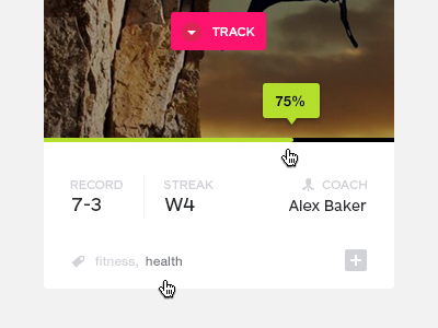
This was the initial design of this widget, however I figured no kitten would die if I take away a bunch of pixels from the photo. I like this approach and use in this project a lot. But let me know what you think guys?
Don't forget to see other shots from this project
***
Thanks all and weekend is coming hooray!
Tweet, tweet...


