Reliefly Branding Identity Design
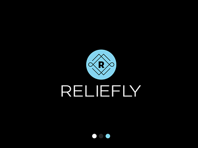
This is the primary logo mark for Reliefly- A Premium CBD brand that provides all-natural, high-quality products to their growing community
who value wellness, quality, and reputation.
This is part of a larger branding identity system that was created along with a complete line of product labels and packaging designs.
Three keyword associations that were made for Reliefly were premium, natural and wellness. Those words helped create a foundation in which we shaped and constructed the brand identity.
The icon mark was created to have a more premium feel and embody similarities that could be associated with a wax seal on an envelope.
This icon was created using the golden ratio to create a various shapes including the droplet element in the negative space of the letter R, as well as appearing parallel on the two sides of the bracket element.
As part of a scalable system, when there isn't adequate room for the full icon (a favicon or app icon) the R element in the center of the icon can be used independently to appear prominent and simplified.
The typeface was tracked out to have a bit of breathing room and create balance with icon.
What made this project even more special was that a portion of every purchase with Reliefly is donated to House Of Grace. House Of Grace is a ministry that offers direct aid to the children and adults of Gressier, Haiti!
This was all around a complex and invloved creative process that resulted in them standing out in their marketplace, saving time and almost instantly boosting their sales.