Parker Vikings Brand Identity Refresh
The primary goal for this brand refresh was to help streamline the process of creating an updated school branding system that could be easily integrated and showcase a consistent look throughout the school programs and departments.
In addition, it remained important to keep classic traditions alive and stronger than ever in a refreshing way going into the new decade.
This branding system was crafted to be simple, appropriate and easily identifiable while staying true to the school's history, values and traditions.
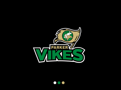
This is the primary combination mark that was approved, which is part of the branding system titled "Truth in Tradition".
The logo family is made up of three main visual elements:
•Mascot (Emblem)
•Wordmark
•Combination mark
This solution was chosen to keep a classic tradition alive in a simplified and modern way. With simplified design elements and refined symmetry using the golden ratio, this new branding system integrates well and showcases consistency while still being conservative to the Parker History.
Proposed solution and art by Matt Nemetz