DailyUI 002
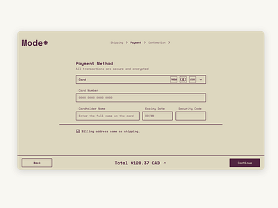
DailyUI 002 - Checkout page for a vintage clothing website.
I wanted to keep things exceedingly simple, so I decided to show one thing per page and only include payment details/items on this page.
I also wanted a colour palette that reflected the vintage theme. These colours makes me think of my favourite vintage/thrift stores that are super tiny and but packed to the ceiling with so many items that the lighting is dimmer 😅
Constructive critiques welcome 😇
More by RedBit Development View profile
Like
