Die Losung
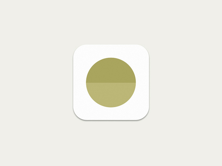
The logo for my first iPhone App. The app shows 2 different bible verses each day.
It was very difficult two find an icon for the app. I didn't want to use a bible, cross, book, calendar… That would be just stupid – well, and way to simple. I used a circle, represents wholeness, the two different colors stand for the different verses. The logo should transport the preciousness that the Word of God has.
Check out my teaser page: www.absurdjon.com/losung