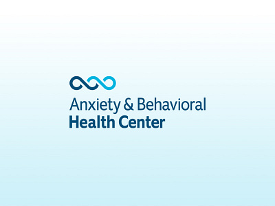
Anxiety & Behavioral Health Center Primary Logo
Just wrapped up a brand identity project for a new anxiety & behavioral practice here in Maryland. Here's a look at the primary logo.
One part of ABHC's methodology is that clients face their challenges head-on, much like one would dive into a wave. With courage and aptitude, by diving into the wave, one becomes a part of its movement and emerges on the other side, safe and stronger for it. The alternative is not only crushing, but debilitating.
In alignment with this compelling analogy and the established brand foundation, a refined, modern, and straightforward brand identity was formed. The connectivity of the a/b wave brandmark and the friendliness of the logotype reflects both the ABHC brand promise and vision. Furthermore, the brandmark quintessentially captures the connection ABHC has with their clients and the commitment that is required for them to overcome life's challenging ebbs and flows.
