Sonar - The Project Management Tool
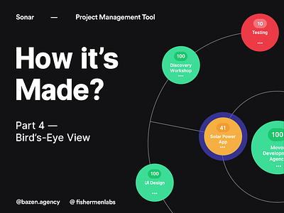
Today we have another post from the "How it's made series" for you! We have presented you the Bird’s-eye view option and it's components. 🦅
So why do we even need it?
_
About the project: Sonar project management tool
Collaboration with @FishermenLabs
Design by @TajanaTomic
_
Bird’s-eye view feature allows us to be in touch with every ongoing process in the company, weather it's our project or employee activity. It helps us to see projects status from a different angle which is incredibly important for managers of the company, so that they can fully cover everything that is going on with just two clicks.
_
Colors have very important role in this. We used different shades to present project status. How did we do that? Colors such as red or green have a universal meaning - red is bad, green is good. They help us create feeling of something familiar within a user, so that he or she could better understand the meaning of a design. When a user sees something that is familiar, it becomes much easier for him or her to use it. 👐
_
Use empty space wisely. For example, when it comes to positioning of the elements, we have set controls at the top so that user can manage easily. The map section is the moving part, and because of that floating buttons in the right down corner were not an option.
_
If you have any additional questions feel free to ask them in the comments and we will help you out! 👇💖


