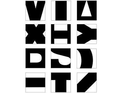
Balance Using Cropped Letterforms
This typography exploration exercise uses symmetrical and asymmetrical balance and creative cropping to develop a series of interesting typographic compositions. We were to use upper case letters set in 400 point Univers 75 Black.
For each letter we had to choose to develop one counterform using vertical symmetry, horizontal symmetry or, diagonal symmetry and cropping them. And to complete six symmetrical and six asymmetrical versions.
More by Nicholas Navarro View profile
Like
