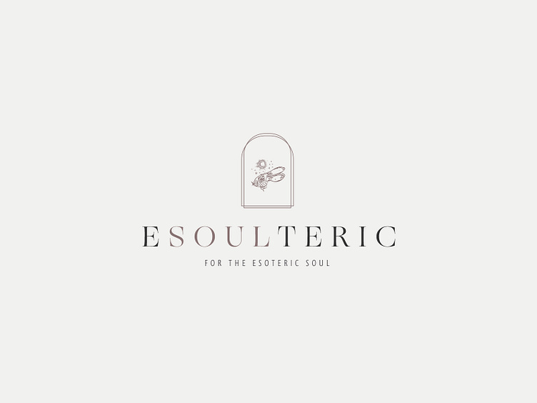
Whimsical Illustration Logo Design
Subtle touches are what make good design.
Let me explain...
Not every part of a visual identity has to be HUGE and the main focus. There should be space for smaller more intricate parts of a design.
The purpose of doing this is to add DEPTH to a design.
Depth allows the audience so see something more that just "a design". Depth allows a new dimension.
In this clients case there are few ways that depth is created.
1. Colour shifts in the name 2. Visual layering of the archway 3. The logo mark being relatively small compared to the text 4. The shape of the overall design going from small to large to small
These details are not specifically noticeable BUT they aren't supposed to be. Subconsciously they still add depth whether the audience knows it or not.
Thats the care and attention that goes into all my branding and design projects!
Press "L" to show some love!
