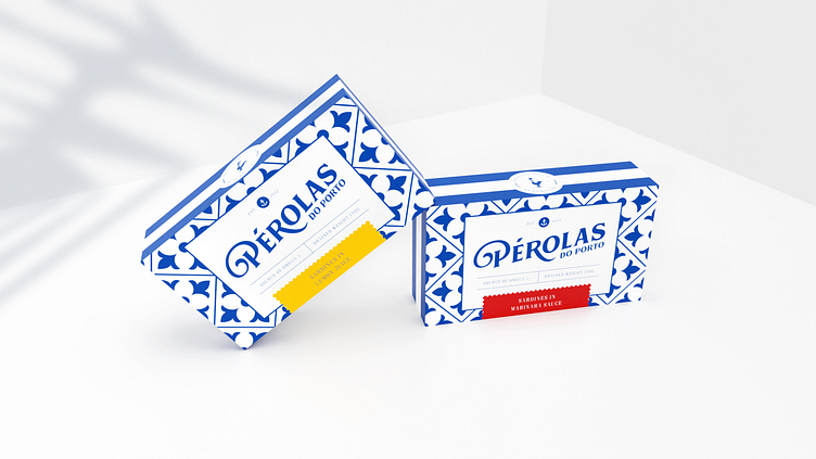
Pérolas do porto
PULP were challenged to create a new brand and visual identity for a Portuguese seafood company with heritage spanning back to the 1950s!
It was our challenge to alter the perception of tinned fish from a post-rationing pantry staple to a sun-kissed gastro treat. We were asked to conceive of a brand name reflecting Portugal’s bountiful coast and evoking the freshness of its infamous seafood.
We present: Pérolas do porto
More by PULP. View profile
Like
