Patient portal
👋Hey y'all!
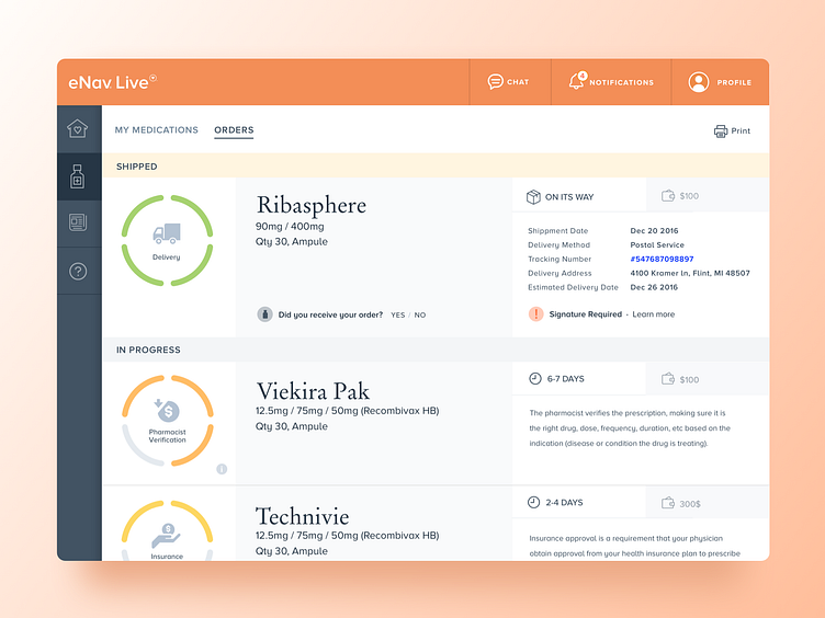
This is a patient portal design I created for a client in the healthcare industry. After a few months of research, we identified some customer needs, which we then solved for. In the designs, I'm using the bright orange gamut, as it is psychologically proven to improve a person's mood. I have also intentionally used big buttons and black on white text, so it's easy to navigate and read. During the research, we also understood it's important to see what step in the process the medication is on and provide estimates and explanations, all of which is reflected in the designs.
I hope you like it. Follow me for more! ✌️
More by Miro Kirov View profile
Like
