Logo work for Reduce The Power

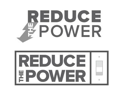
I am working on some beginning concepts for an energy company.
The company role is to help hospitals and other big organizations reduce energy consumption.
The first logo is showing a connection between solar power as it casts a shadow and the arrow is meant to show energy reduction.
The second logo is very much to the point, turn off lights and you will reduce your power consumption.
I like both of these ideas but feel they could be improved. Would love some feedback before I show them to the client.
colour is on its way, I find I like logos in greyscale to start, if they work like this they will work with colour.
Thanks guys!
Check out my other work