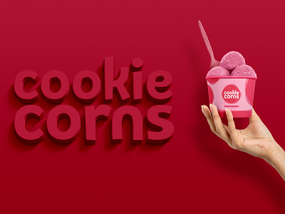
Cookie Corns Logo
As creatives say, the design is about details. To get the right feeling of a visual brand identity even the roundness of corners matters, and sometimes that leads to a design challenge, as it was in our case. The typeface is born to be sharp and edgy. At the same time, Cookie Corns is friendly and hard shapes are in conflict with Cookie Corns’s mood. Defining the shape took more time than usual, but at the end of the day, I successfully overcame this challenge by customizing the typeface to make it connect with the brand attributes. I double-check everything to make sure that the final logo looks balanced and solid measure, and it's able to work on different sizes and responsive to work in different places.
𝗪𝗲 𝗱𝗲𝘀𝗶𝗴𝗻 𝘀𝗼𝗹𝘂𝘁𝗶𝗼𝗻𝘀.
Available to help you achieve your goals through design.
Instagram | Behance | Twitter | Pinterest

