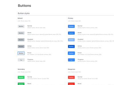
Buttons - Design System Guide Lines
Hey there!
It's been a while (a very long one) since the last time I posted something, actually I have't posted anything since I stopped taking freelance jobs and joined the wonderful team at SpotMe as their first Product Designer.
What have I done?
During my time with them I have worked on many aspects of the products we offer, from building completely new modules to improving the existing ones impacting the event experience for hundreds of thousands of users.
The project
But without a doubt the biggest project we tackled last year was redesigning our CMS Backstage to enable our costumer to build incredible experiences on their own.
Working together with the Web Development team we started standardising UI components and documenting them for a faster and streamlined implementation. Designing components that would had been used across all areas of the product was challenging as we faced years of development without guidelines and changing teams.
The benefits
Tackling the project from two angles, design and development, allowed us to improve the user experience in different aspects such as continuity in the UI provided to perform similar actions as well as fixing positioning and misusage of certain ui elements. From the perspective of the development team it allowed them to clean the code by reusing components and setting up variables as design tokens. (I will post more about this too) What this project gave birth to, besides a completely refreshed look and feel to our core product, is the SpotMe Design System, a living project that is reshaping the way we build interfaces at SpotMe.
Have you ever used tokens and variables to set up the foundation for your UI components?

