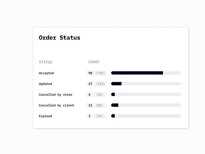
Horizontal bar chart
This is my very experiment with figma. In the pie vs bar chart rivalry, bar charts readability is often pretty bad. Horizontal charts with separated bars are pretty rare, but I think they are great at displaying annotations and labels. So here's my attempt at designing a clean dashboard component that is good at showing proportions. Of course it is not perfect, so for a better readability, number of items should be limited.
More by smknstd View profile
Like
