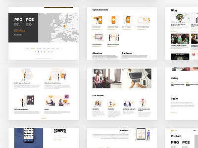
Nextap Web Redesign (UX/UI/Illustration) - Case Study - Part 5
As you probably noticed from the previous post (If not, go check them out!), we are fans of minimalistic approach. We firmly believe that clarity of information is above all, and the design reflects that philosophy. Do you agree?
👉 Full case study (It's worth it! 🔥)👈
Don't forget to leave a like (press “L”) ❤️. We would like to hear your feedback as well 💬.
More by nextap solutions View profile
Like
