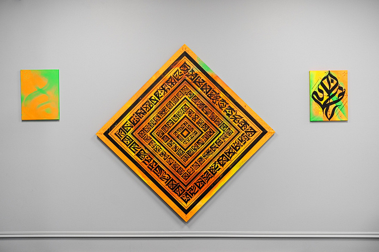
◈ HARM ♢ NY ◈ 颜 色 的 调 和 ◈
Harmony is the balance, the Symmetry of the Body.
Color Harmony is an aesthetically significant relationship of colors in the composition of works of art, subject art and design. _________________________
◈ ℭ combination of orange color juicy, bright 🔥 Basically, they are built on color and thermal contrast, since the main tone is a rich, hot color.
one of the most important tasks of the composition is to ensure the balance of color masses.
ℭ there are various ways to emphasize directions within the picture space — horizontal, vertical, diagonal, circular, or a combination of them. Each of these directions has its own special expressive meaning. ________________________________________
◈ "Horizontal" - emphasizes the weight, length of space and its width.
◈ "Vertical" is the exact opposite of "horizontal" and expresses lightness, height, and depth.
◈ The point where the horizontal and vertical intersect appears as a particularly accentuated place. Both of these directions are planar in nature and when used simultaneously create a sense of balance, strength and material stability.
Китайские Chinese painters, along with vertical axes, consciously used diagonal movement to take the viewer's gaze into the depths of the landscape, and these diagonals were often lost in the sky-high distances. ___________________________________ • 𝕿𝖊𝖈𝖍𝖓𝖎𝖖𝖚𝖊 : ᴹᴵˣᴱᴰ ᵀᴱᶜᴴ
• 𝕮𝖆𝖓𝖛𝖆𝖘 𝖘𝖎𝖟𝖊 : 𝟏𝟎𝟎 乂 𝟏𝟎𝟎 𝖈𝖒
◈ The graphics in the composition consist of the following colors: ______________________________ * matte Black * glossy Black * matte lime Green * matte Neon Green * matte Fire Orange ______________________________
◈ Splashes of different colors and shapes: _________________________
* matte Fire Orange * Matt malachite Green * matte Yellow Fluorescent pigment * matte Black / glossy Black
◈𝕷𝖎𝖒𝖊 𝖆𝖓𝖉 𝖌𝖗𝖊𝖊𝖓 𝖞𝖊𝖑𝖑𝖔𝖜 𝖆𝖓𝖉 𝖓𝖊𝖔𝖓 𝖌𝖗𝖊𝖊𝖓 / 𝖌𝖗𝖆𝖕𝖍𝖎𝖈𝖘 𝖔𝖓 𝖈𝖆𝖓𝖛𝖆𝖘。 𝕺𝖗𝖆𝖓𝖌𝖊 𝕽𝖊𝖉 𝕬𝖓𝖉 𝕱𝖑𝖆𝖒𝖎𝖓𝖌 𝕺𝖗𝖆𝖓𝖌𝖊 | __________________________________
2̩̝̞̦̉͋̊̑͋̕̕0͍͚͎͓̼̂͌̍̕͠1̴̣̟̭̤̻̩̽̊̌̎̅̓9̴̖̣̜̒͒͑͑
ϻØᴅᴇʀɴ ₡ʜɪɴᴇsᴇ ₡ᴀʟʟɪɢʀᴀᴘʜʏ
◈ instagram.com/haski_hashiqi/
