A is for Airport Designer
Work in Progress for a company who designs Airports and all that entails. They want an updated look that pushes them into bigger clients, bigger jobs. Right now they do smaller airports.
I am trying to stay away from an Airline feel, and concentrating on the shapes that airport designers use to create beautiful spaces.
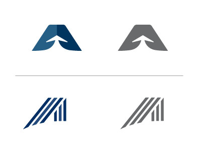
The top vaguely represents an airplane on a runway (which is included in airport design), it represents moving forward and upward, which is what the company wants to do, and of course, an A.
The bottom concentrates on the unique lines and shapes you see inside airports, while forming an abstract A. Airport architecture is some of the best architecture you will find.
More by Robyn Britt View profile
Like
