Prismatic App Background
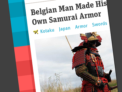

Here’s a sneak peek into the upcoming Prismatic iOS update. In addition to trying to make the app more scannable and readable, we also want the app to feel more fun and charismatic. That’s where this hidden background comes in—to show off our new brand colors and get some personality in a spot that doesn’t interfere with any of the content. Let us know what you think.