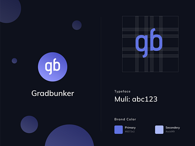
Gradbunker | Brand Guidelines
Hi Folks 👋,
Grad Bunker is a knowledge-based platform and service provider for international students who move beyond borders for their grad and undergrad studies. I have developed brand guidelines for them & made the logo. The existing logo wasn’t so good to represent the brand identity. Moreover, Many elements are clustered in a small icon which makes it harder to recognize. So here I have decluttered the whole thing. As the main branding letters of our App is “gb” I have focused on it more to create a bold brand value. First I pick our color theme. In color psychology, blue’s color meaning ties closely to the sea and the sky. Stability, harmony, peace, calm and trust are just some of the feelings your customer may feel about your brand when you integrate the color blue into your branding. Some retailers add their guarantee, trust certification or free shipping icons in a blue color to strengthen the trust aspect the color is known for. make a gradient & use it as a background which is giving it a premium look. Then I illustrated the two letters “g” & “b” in such a way that it looks symmetrical from both sides. it also looks like a symbol. Being symmetrical with a clean & simple aesthetic it will help people to recognize easily, establish the brand value & trust.
Let me know your opinion. Press "L" & show your love.
✉️ Feel free to knock me for freelance projects.
You can find me: Website | LinkedIn | Twitter | Behance | Telegram | Uplabs
