Dribbble ExploreCanada 03
The UK has counties, Canada has provinces and territories. Same idea, only bigger. Much, much bigger..
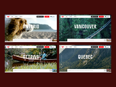
Expedia approached us to create an exciting CMSable content site for Explore Canada. Available to view here https://canada.expedia.com/ This was the initial creative for stage one of the responsive site.
Packed full of features (With more to come soon) The site allows users to view 100’s of blog articles, galleries, videos and itineraies helping your curious traveller or your seasoned explorer to unearth new adventures in Canada.
The site was an exciting opportunity to create a design that was fully widget based allowing the client to fully control each page adding to it as they see fit.
Launching with 5 regions, specifically for Spring in Canada, as Summer and Winter approach the site will grow in content and creativity.
An add on - The Explore Canada brand guidelines are exquisite, wonderfully thorough thinking across every aspect from typefaces to imagery. One of my favourite sections was colour, and the names for each of the colours in the colour palette.
Canadian Red Fag
Prairie Yellow
Great Lakes Blue
Maple Red
Aurora Purple
Forest Green
Sunset Pink
PacificTeal
And Rocky Mountain Black - Wonderful
Thanks for reading.
