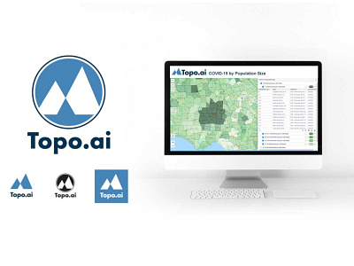
Topo.ai Logo Design
Topo.ai (topo.ai) is a security platform, providing realtime situational awareness, critical event management and analytics for corporate security initiatives and operation centers. As a newer company they had a logo in place that they had been using to get up and running and were ready for a new look that would represent the company that had been created and where it was heading. The logo that we created visually symbolizes both the charts & graphs that come from understanding lots of data as well as the clarity of perspective you gain at a mountain top. The juxtoposition of these two ideas shows how this company can take a lot information (down in the weeds) and restructure it and present it to give you a “birds eye view.” This allows security professionals to make better and more informed decisions on a minute-by-minute basis.
The actual logo design that was created needed several variations. We created a version that was contained in a “seal” type look, one with the triangle shapes without any kind of border and then another that was in a horizontal format. Each of these variations then had their full color version, solid color version and reversed (white) versions designed as well.
Currently, the Topo.ai platform is offering a free, interactive COVID-19 map that is extremely detailed down to the county level. Something that is extremely helpful to security and medical professionals. You can view it here: topo.ai/covid-19-map.
