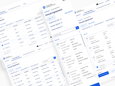
Responsive dashboards, tables, filters
'Translating' busy tables from desktop to mobile is always fun.
In this case users do not do any comparison with table data so rearranging layout for vertical stack for mobile makes sense. By controlling the height of the table container we also make sure that filtering above and actions underneaths are not too far from what's in the current view.
Having significant group of users in their 50-70s and accessibility and usability as priorities add to the challenge...
Feedback, especially negative, always welcome!
More by Peter Grochowski View profile
Like
