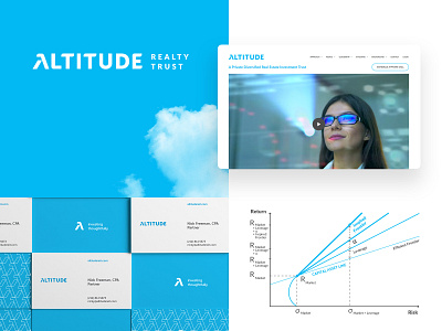
Brand identity for ALTITUDE real estate investment fund


Hi everyone,
I am new to dribbble and want to introduce my first shot here.
Altitude is a real property fund using modern portfolio theory to achieve the highest income. That’s why we wanted the branding to communicate that we are different in a sophisticated, technology-driven way and that our investment strategy outperforms other companies on the market.
I accented first letter A as Alpha (an industry term for income) and made it a major graphic symbol. Azure was selected as a basic color, to create a feeling of height, sky, and air. The second is about exploring the blue ocean of investment opportunities away from the bloody red oceans of cutthroat competition.
Full case is here on Behance.
Cheers for checking out, truly hope you enjoyed it.
Wanna create something great?
Feel free to contact me: evgeniya.shlepova@gmail.com