Onibag - Logo Animation
Throwback to 2016: logo animation shot for Onibag.
Onibag wanted to refresh a logo concept for their disruptive delivery platform. With the growing delivery network and clients all over the US, Onibag was ready to unify their marketing strategy under a solid detailed brand. I was invited to completely rebrand and launch Onibag’s platform and product suite.
What is Onibag?
Onibag delivery platform provided an effortless way to make any personal or business delivery happen. Forgot your cellphone at parent’s place on holidays? Want to send a huge load of your craft beer to a bar in another city? Or get your stuff from your ex? With Onibag it’s all was real and pretty easy. Personal or business - they all could order delivery with a flick of the finger from a smartphone or desktop.
How did I help?
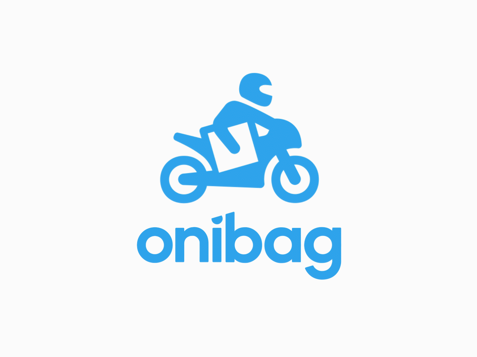
Onibag wanted to appear as clean, simple, friendly, and easy to use. Their personal request was to keep the motorcycle image in the logo as an idea of rapid speed, disruptiveness, freedom, which was integrated into their logo mark. Together with the great team at Onibag, we managed to align their brand identity and visual language with their evolving business needs.
In addition to the brand, there were designed their new website, illustrations, iconography, an updated color scheme, and a general design system as well as mobile applications, web-dashboard for business and end-user and a couple of satellites web-applications.
Services provided:
• Branding and creative direction
• Web Design
• Mobile Design
• Front-end Development
