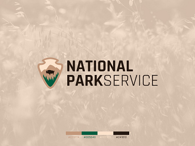
National Park Service Logo Concept
This was a quick little logo challenge that my co-worker and I did as a side project. We chose to redesign the National Park Service logo and gave a deadline of 2 weeks.
I chose to keep mine simple and clean. My idea was to still keep it badge-like and keep the arrowhead as the shape. All the elements inside the arrowhead were brought back from the original mark.
The typeface is Rajdhani, a free font from Google Fonts.
More by Alex Ciampi View profile
Like


