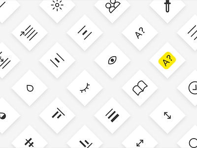
Some more icons for Dash
It's been a year since Figma launched its new UI, and of course, it has been a huge reference for me ever since.
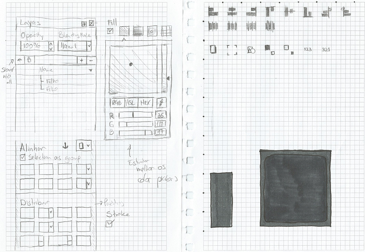
Dash was born from an attempt to review Inkscape's UI. I was giving my baby steps as a UI designer and I had never designed a desktop app before.
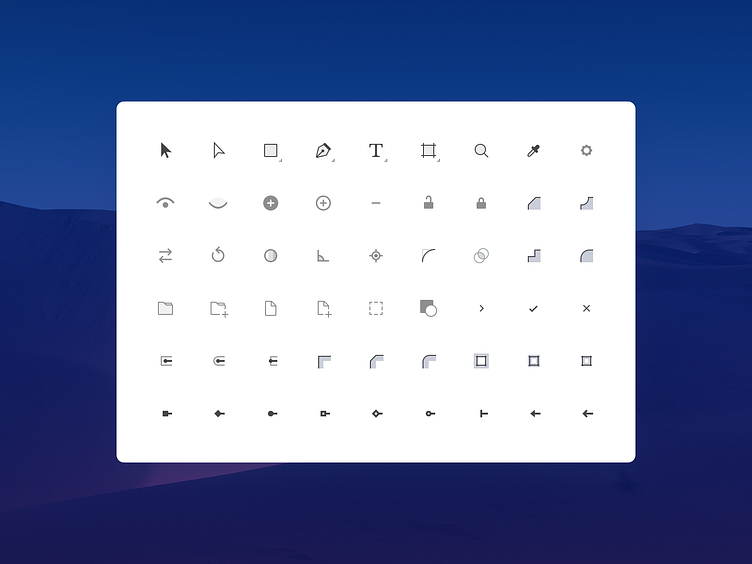
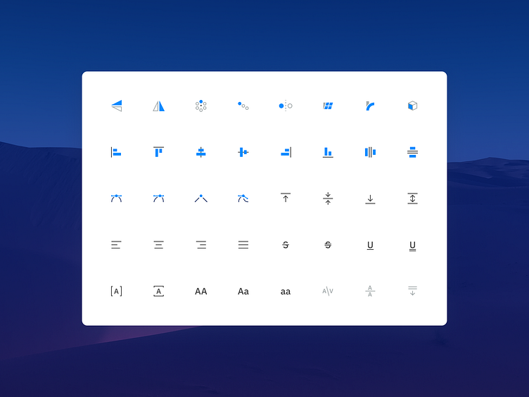
My main references were Adobe, Sketch, and Affinity, and I wanted to honor their subtle glossy icons. I made tons of experiments, but in the following year, I decided to adopt a different approach, both in terms of art direction and project scope. I was then heavily inspired by Figma, Adobe XD, and even Sketch redesign.
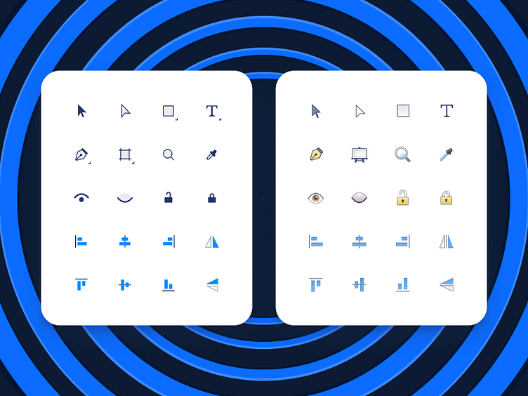
You can see the old and the new icon styles in this shot, and how the new icons look in the complete icon set. It was not the aesthetics that changed, but also the concept and meaning behind some of the icons.
What's your opinion on this new design direction?