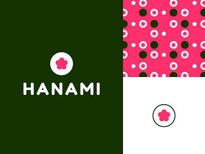
Hanami Sushi Logo
I made this about a year ago... I was eating so much Hanami's sushi that I started imagining how I could make their brand look better 😅 I guess I was a bit high on sushi 😁
You might notice that the colors of the MadPizza rebrand are basically the same and that was an unfortunate coincidence that happened after I did this 🧐 Well, the good thing is, this is completely speculative and is not going anywhere.
I still stand by the colors that I picked 😌 Pink for salmon, white for rice, and green for nori. 💖🤍💚 Pure sushi love!
On the inside of the roll, a cherry blossom, or a sakura, taking the salmon’s place ☺️Since Hanami is the tradition of enjoying the flower’s beauty.. it made sense to make the twist 🌸 💞
More by Joana Vieira // CrayCrayOwl View profile
Like
