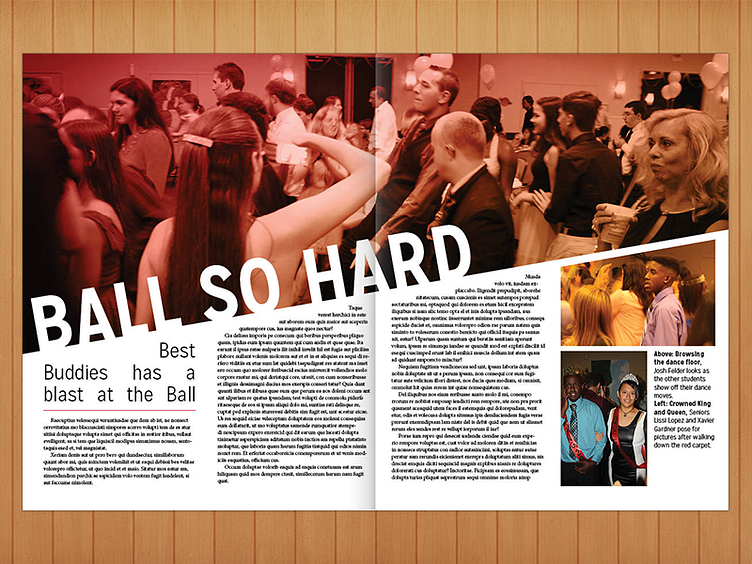
Yearbook Spread
Hi Dribbble, Not sure if anyone remembers me here, but I've kinda switched from UI and web design to print design the past year to work on my school's yearbook. As design editor, I'm planning the look of the book for next year, so any critique is greatly appreciated to know how to improve the design. The theme is "reach", so we're trying to use a lot of diagonal lines that stretch across the page.
Thanks!
Edit: Also, I get to make a project involving technology for the final project for my IT class, which will probably be a website. I'm excited to return to web design for that!
More by Ben Muschol View profile
Like
